Attractions Across the Atlantic
August 4, 2010
Here is a look at ten different slides from England spanning the years 1948-56. While this sample size is too small to draw generalized conclusions, having a look at this eight-year time span does allow some space for free range theorizing - a temptation which I find irresistible.
The ten slides in this mini-collection include:
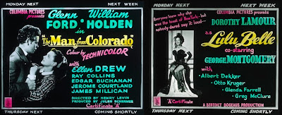
* Lulu Belle (1948)
* The Man from Colorado (1948)
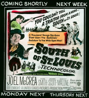
* South of St. Louis (1949)
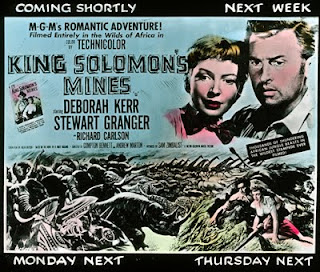
* King Solomon's Mines (1950)
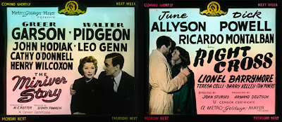
* The Miniver Story (1950)
* Right Cross (1950)
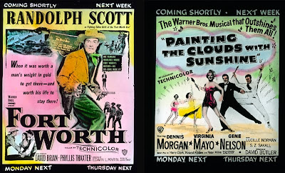
* Fort Worth (1951)
* Painting the Clouds with Sunshine (1951)
* She's Working Her Way Through College (1952)
* The Eddie Duchin Story (1956)
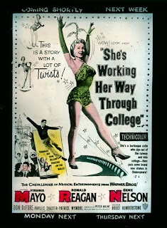
The films are all American features, predominantly romances, musicals, and westerns. Ronald Reagan even makes an appearance in She's Working Her Way Through College (1952). That's him at the left getting smooched by a couple of coeds. The tag line for the film states "This is a story with a lot of twists!" Yes indeed, more than they could have possibly imagined.
One of the collection's most obvious aspects is revealed by way of the slide for The Eddie Duchin Story, a film released in 1956. This is the most recent date I've found for a British slide and comes four years later than the latest slide I've found in the United States (Retreat, Hell!, 1952). Were slides used in the UK later than this date? Probably so, but so far I have yet to find an example.
All of the slides are physically constructed using the double-pane design (no cardboard frame) and lack any sort of information printed in the margins. The fabrication materials are identical for all ten slides, which leads me to the conclusion that all ten were manufactured by the same company. Of course the slides all adhere to the UK standard 3 ¼ inch square dimensions, compared to the American standard 3 ¼ x 4 inch rectangle.
Because the physical slide is square it just as easily accommodates a vertically oriented graphic design, while American slides must consistently adhere to a horizontal orientation.
Another stylistic difference from American slides is that the British slides lack the blank space below the image which was used by exhibitors to manually handwrite the screening dates. Instead, the British slides all feature a choice of four different scheduling messages printed near the corners of every slide: "Coming Shortly," "Next Week," "Monday Next," and "Thursday Next." Before projecting the slide, the projectionist would black-out three of the four options, leaving only one which would be visible when the slide was projected. Aside from the tidiness of this approach, it seems clear that Monday and Thursday were the standard days for program changes during this period.
In America the late 1940s and early 1950s was the period in which coming attraction slides gradually faded into oblivion. Over this same time frame the design of these UK slides evolved as well. The earliest slides in this group, 1948-50 were quite clearly represent designs specifically tailored for the lantern slide medium. The graphics feature a single image against a neutral background and the text is large and bold.
One other thing I note in the 1948-50 slides is the overall consistency of typeface, design, and color. The two 1948 slides are feature pictures from Columbia and display identical graphic designs. Likewise, the same is true with the two slides for the 1950 MGM films. Were these designs specific to the studios or just a case of styles changing over time? ...or is it just coincidence? With a sample size this small it is impossible to say.
1951 it appears to be the beginning of general shift in design strategy. From this point forward the slides become significantly more poster-like. The orientation of the image rectangle changes from horizontal to vertical (like a poster) and the graphic design appears to simply replicate what might be the one-sheet poster. The graphics also become significantly more complicated, with multiple and multi-sized images and the typeface sizes ranging from large block letters to exceptionally fine print.
There is obviously more work to be done in this area, but from this meager evidence it appears that 1951 was the year that the creation of individual designs for lantern slides gave way to simply reproducing the poster onto glass.
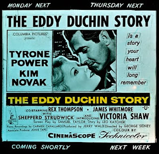
Interestingly, the design for the most recent slide, The Eddie Duchin Story (1956) appears to return to the traditional slide design (horizontal orientation, single graphic image, etc.) Or does it?Taking a close look, it appears that this slide was created by cutting up a poster, rearranging the elements, and then photographing the result. Judging from the cut-out outlines around each text block, it seems obvious that little effort was made to conceal the seams in the patchwork design. If only they'd had PhotoShop back then...